
Macenzie Collins
Planning

Hardware and Software

Digi Pack/Advertisment
One of the products I have to make and design is a Digi pack that fits into a set along with the other products I will produce ( music video and poster ). The main software that I will use in the editing process of the product will be Photoshop as this enables me to edit and alter different aspect of an image making it conform to the conventions needed for an indie/rock music video. As well as being able to change effects and appearance it will also allow me to stick to specific measurements and scale as this can often become a challenge if the cover is busy with different elements contrasting against each other. Although the majority of editing will be on photo shop I will also use adobe to put each panel and section together. This therefor will ensure each aspects of the Digi pack is covered through the different uses for each software.
This is the tool bar that can be seen on the left hand of the screen when opening up a blank document. This will be a prominent aspect in editing different sections of both the Digi pack and poster. After editing and altering different elements I will be able to transfer them over to adobe InDesign where I put the whole product together.


This is the lasso tool that can be used to cut out sections of an image or design. To make this tool easier, by holding down the mouse onto the arrow it gives alternative options for the same tool for example, there is a magnetic lasso tool which means it will automatically follow a specific area that is clearly different from the background as long as you follow the mouse close to the section.
The eye dropper tool is used to grab colour from an image that you may want to use however, might be finding it hard to find the exact colour swatch the photo shop provides you with. If you hover over colour you wish to take and click onto it the dropper tool will pick the colour up and transfer It over to your swatches. This then enables you to use the colour through out your product making it easier to create a house style surrounding a consistent colour scheme.
The zoom tool will help with being precise with measurements and editing detailed aspects that I may not be able to do without. This also gives me the option to zoom out which allows me to gain a different perspective on the product.
The gradient tool, can be used to create a transition from a dark colour to lighter tone which I can incorporate with in my digi pack as through research I have found that they usually use an abstract image or illustration to pull the title and theme of the songs together. This could be affective for the background or even to add tonal work to the illustration as this can make an ordinary still image quite intricate and aesthetically pleasing to the consumer
Music Video
To shoot the footage that I will then edit on premier pro I will use a Sony X camera which will enable me to capture the shots at the right angle. An additional feature that I will use is the zoom tool as one of the main feature of my music video is the frame zooming into different images that will then plays out a memory. This will create a smooth transition between both the first perspective and second perspective when zooming into the shot. This camera also has an auto focus feature which will help when ensuring all shots are focused as well as using a deep or shallow focus with the close and extreme close up shots.
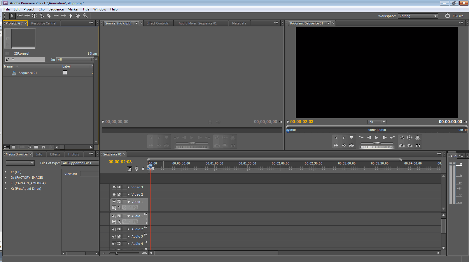
Here is an example of the initial page that opens with premier pro. The bars in the lower right hand side is where the clips will be placed and ordered. This will also allow me to clip and resize files to enhance the effect of each shot. An element that I will be manipulating a lot is the use of colour as the transition from black and white to then clear colour towards the end of the video. I will us the editing software to select a certain element of a shot and enhance the colour whilst turning the rest of the shot into black and white as this will denote the progression from black and white to colour.
Actors


Summer
Elsie Rose
Summer Stewart is 9 years old and will play one of the younger protagonists through out the video. With long brown hair at a medium high of 4ft3 she will play the young version of Esme. She will also be accompanied by her sister Elsie Rose Stewart who is 6 years old and will play the best friend Lana. When choosing actors to play the younger roles I wanted to ensure there was an initial bond between both actors to ensure this came across through the camera. With both of them being sisters the natural bond and friendship is already there meaning the emotion and feeling will be easier grasp through the video. Home videos will also be used for a few of the even younger memories for example learning to walk. Although there will be a change in quality I believe this effect will coinside with the conventions used through out the video.
Jemma
Eloise

Jemma Robbins who is 17 years old will play the older version of Esme. With short brown hair and a similar complexion to Summer I thought this denoted the progression through younger childhood to older childhood quite well with the obvious change in appearance. As well as looking for similarity with appearance I also looked for similar personalities as this comes across in the video just as much as the way the characters look. Eloise Morrison who is also 17 years old will play the older version of Lana. Although her hair is slightly lighter than Elsie's, this as well shows the progression through younger and older child hood. However, a necessary key feature was that the older actor had to have curly or wavy hair as this is a key factor with in her character

Digi Pack Plans
Outer - First panel
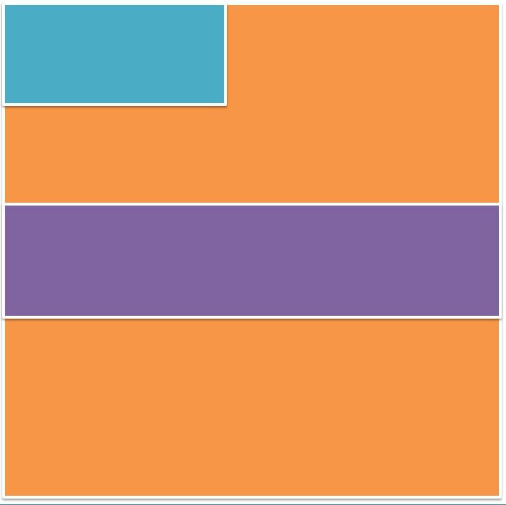


These three layout designs for the front panel have been composed with the consideration for symmetry as through research I have found that the indie rock genre consistently use very basic but effective layout that uses composition to create an aesthetically balanced frame. The main orange square represents the main image as nearly all Digi packs that I have researched uses one main image which is then overlaid with the additional information like the bands name (blue) and albums name (purple). Both the middle and last layout focuses on the use of size to denote a balanced frame with all the elements harmoniously working together. The first layout however, follows the use of having the bands name in the top right hand corner which is also regularly seen with a lot of CD's/Digi pack as this is one of the first places are eyes are drawn to. This is effective as it allows the album and its name be the main focus as the artists name is not central.
Outer - Centre panel


For the outer middle panel I have put the songs list as well either the bands name or the albums name. When the Digi pack is folded together this panel will be at the back which is typically the conventional place for the songs list as it is easily accessible for the consumer. With the first layout I have included the albums name in the top third of the frame which is accompanied by the song list which is covering the whole panel however the text will not have an additional border/background that is overlaid onto the background. The text will overlay the background by itself in a white or black typeface to follow the conventions of a chromatic colour scheme. The middle plan simply just uses the songs list with nothing else as depending on the main image used as the background this can be effective for the aesthetic depending on the composition of the songs list, taking into account the hight and width of what it will take up on the panel
Outer - Right panel


For the outer central panel I decided to include either a passage from the artist about the album which would consist of the reason for making the album, ideas behind the songs or what they want the consumer to gain from the album. Or like denoted in the middle representation for this panel to be kept plain with just the main image used however, will be edited slightly different to show progression through the panels. As well as this I can use quotes from songs as well as graphics as a way to go against the conventions and create something a bit different to entice consumers to something aesthetically unique.
Inner Panels - Interchangable


For the inner panels, I did these all as one. Each one of these panels is interchangeable depending on whether two or one cd is included. If I use two cds, each outer panel will include a cd either one that slides in and out from an outer casing that will be attached to the base or a cd that simply clips onto the plastic ridge in the centre. The middle panel will then have a small booklet that will have each song and the lyrics. Although this is not always seen in indie rock albums I think that this would hep wen aiming towards a younger audience.
Advertisments Plans

With this advertisement plan I also focused on the composition however did not rely entirely on the three third rule. The orange and red box in the right hand corner represent the bands name and albums name as this the most is integral aspect in advertising to the consumer especially with in a magazine. The reason for this being, a lot of customers often flick through magazines and ignoring advertisements However, if the title of both the artist and album are prominent and visual to the audience with in a small glance it will grab a more substantial amount of attention. I have also incorporated a pug in this ad which will include the price and will use a bright bold colour behind it to highlight the information. This is also a way of contrasting against the chromatic schemed image as one of the main conventions of the indie rock genre is the use of black and white. This will be used through the colour of text and elements within the image. The bottom strip will contain the information about the albums i.e. release date. This will follow the house style in the sense of typeface and colour however will have slight changes to ensure the difference between the name of artist and album is distinctively different. This then leaves the central section of the advertisement completely blank which is a convention that can be seen regularly with in the indie rock genre as the use of imagery and visual effects is one of their main attributes they use to manipulate and grasp the audience.
For this advertisement page I relied on the use of symmetry to make the aesthetic balanced and visually harmonious to the consumer. The blue box covering the entirety of the space represents the main image that will be used as the whole background. Through research I have found that a lot of indie rock advertisements use a whole image for the background which is then overlaid with the essential elements needed i.e. the artists name, albums name and the information for release and when it is available to the consumer. I have placed the artist name in the top third as this is a regular convention when research different indie rock advertisements. As well as this, this makes it easy for the consumer to recognise what the ad is for as the artists name would be more established than the soon to be released album. To compliment the sizing of the artists name, central to this I have placed the red square which represents the albums name in the centre of the page. With the composition of the page I have tried to incorporate the three third rule as this has become an efficient way of placing different elements. The yellow square which is the smallest however will have smaller text and will include the information that is essential in selling the product. This will include the date of release, price and a small picture of the album cover.


Again with this advertisement plan I have focused on the use of composition as this is an integral part of how something aesthetic is perceived by the audience. However with tis plan I have used mirroring in the sense that what is on one side is on the other although the right hand side only uses one box as the content that will be used is limited to the use of three sections as this is a convention that I have found throughout research. The orange rectangle represents the placement of the band’s name. I have decided to locate this at the top as the band will be more recognisable for its name compared to an album that is yet to be released. The album is then positioned in the centre of the page which goes against the idea of the artist name being the most important as the connotations of being In the centre suggest importance and power. In the left hand corner (yellow box) the information will be kept for example the price and release date. With the layout following the three third rule however with the central line going horizontally down being free of content this means the main element of the image will be central to the frame instead of perhaps being directed either the left or right size which is a norm in the indie rock genre.
Schedule

Costume and Props


Location

Through research i have found that the majority of indie rock music videos have a substantial amount of the shots outside. I have conformed to this convention by using coat water as this will allow me to carry out the differing memories in an outside environment. With in this location i will film the shots that consist of a bike rides, feeding ducks and adventurous walks through the forest. Another reason for choosing this location is the fact i want their childhood to not revolve around technology but be outside in wildlife. I will also use similar locations to this for example, the grass and hill area behind ferndale road will be a key aspect as some of the filming will transition from my nan's house on Ferndale Road to the green, park area.
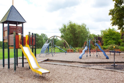
The location of a park will be essential to the filming process as this will be present in quite a few shots. The choice of the park was specific to the association it has with children and fun. For example, the first memory that will be filmed is on a swing set as this had denotations of freedom and suggests happiness. The general park area will be used swell for close up shots of feet walking. However, a key feature that the filming will be dependent on is the weather. Rain and puddles have to be visible as there is a shot that consists of a close up of wellies jumping into a puddle which then is followed by water splashing onto a photograph that is lieing in the grass.
Artist Permission
Consent Form

I have created a small consent form that i will get the guardians of the younger characters to fill out. This is because, they are both under the age of 18 at the age of 9 and 6 which means as part of media regulation i need legal consent from the guardians of that child to be able to film and use them in the production process.


